- A B O U T -
The process of rebranding is always pretty complex, but the use of animation in the centre of it is usually not the first choice. That’s why when we first got in touch with Big Yam Agency, it seemed a bit challenging.
We were asked to create an animation and a set of illustrations for their brand book. We therefore wrote a simple story about self-belief and overcoming difficulties. The huge amount of trust we’d gotten from the client allowed us to create an animation we were excited to work on and are now very proud of.
.
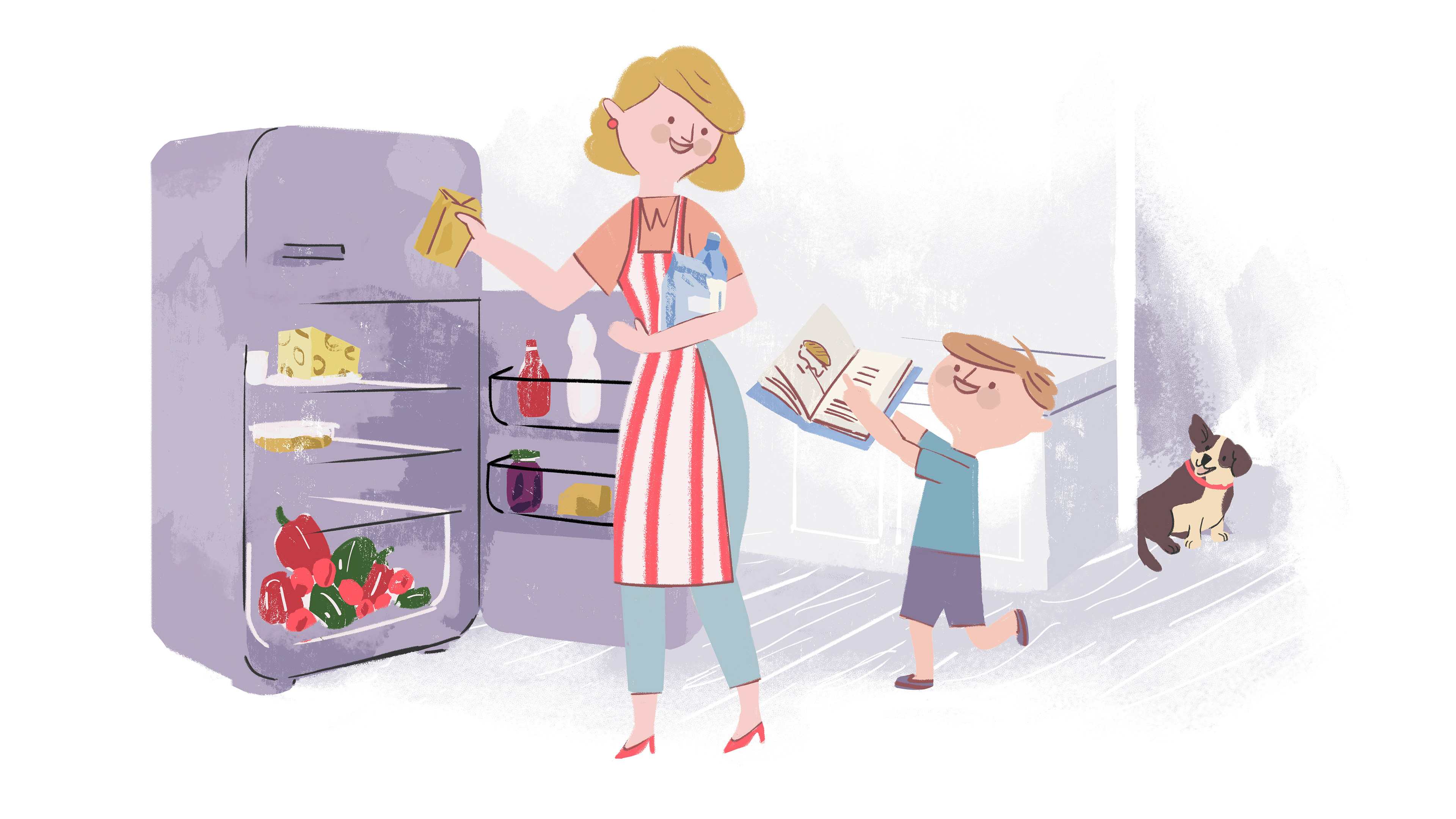
The animation tells a story of a boy, his dreams and hopes, and a dog who is his loyal companion. The challenge was to fit the whole life cycle of the main figure in 75 seconds. We managed to design the character in a way that he’s recognizable at each stage of his life. Music and sound design unite everything, developing through his lifetime and expressing the changes.
Most of character animation was made frame by frame.
Thanks to that, it easily blends in with rubbed, watercolor textured backgrounds
.
.
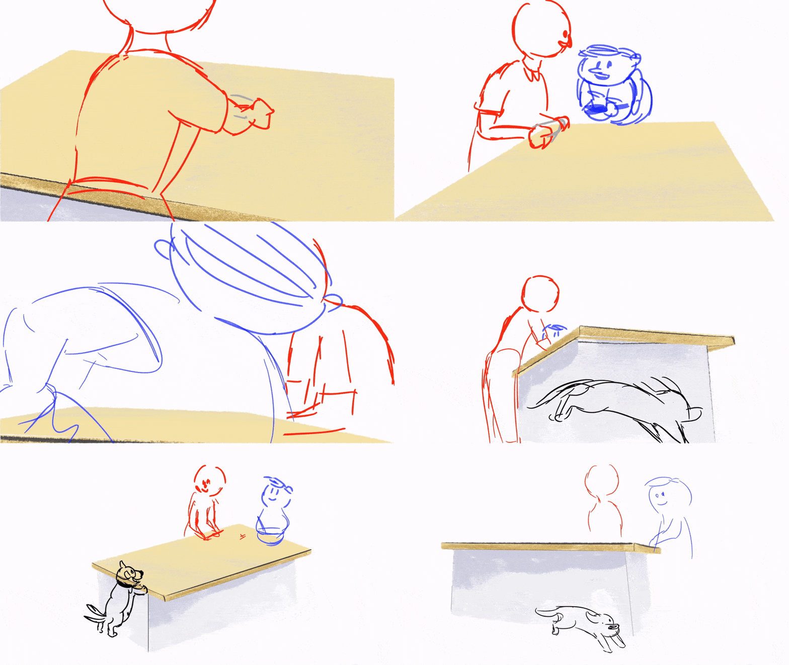
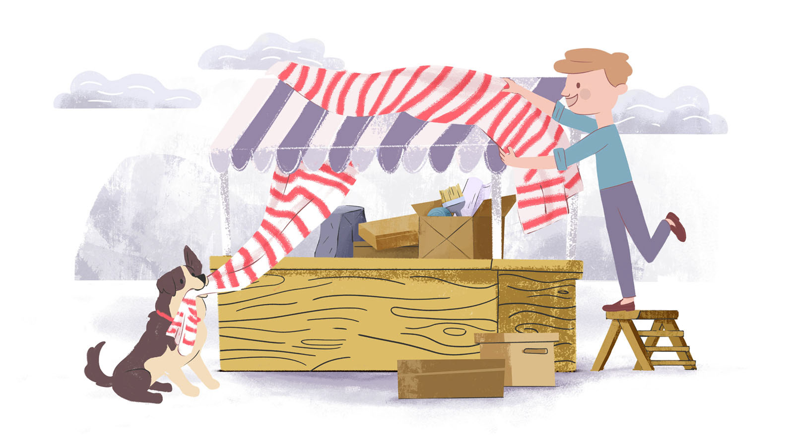
Red and white stripes are a motif that runs through the whole animation. They emphasize the continuity of the story and the heritage of the main character. This was a highly important detail, and so the colour was introduced as early as in the first sketches and the storyboard.
.
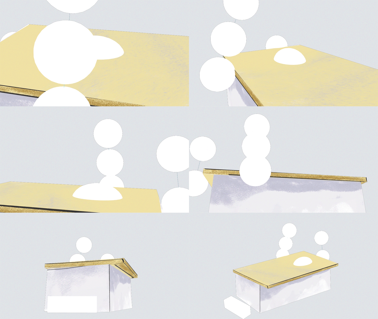
At the beginning of the project, we wanted the animation to be all flat, without any perspective. However, during the process we decided to boost the pace as well as the visual variety of the animation. That’s why we added some depth and spatial scene spins. It is a combination of cel animation and the 3D technique. Several illustrations were used as starting points to create 3D scenes, so those scenes - despite the rotations and other 3D effects - maintain the illustrative character and fit perfectly to the whole animation.
Everything is created on 25 fps and, on top of that, we added animated paper texture with lively grain and a displacement map with same grain animation. Little distortions of the image give a nice final touch to the whole production.

_
- A N I M A T I C -
.
.
Working on this project was a lot of fun. The Client let us use our imagination to the fullest while their confidence in our skills made the cooperation really pleasant. This is why we could afford not only to focus on the goal which is final delivery, but enjoyed the process as well.
Concept art: Małgorzata Jeniec,
Illustration - Małgorzata Jeniec, Joanna Sępek, Ewa Skowron
Animation & Compositing - Karol Szczepankiewicz
Music Composer - Andrzej Strzemżalski
Copywriting - Maria Pawlikowska
Art Director - Sławek Wydra
Production Management - Mikołaj Błoński
Client Service - Piotr Zapałowicz
- T H A N K S -
we hope you liked it!
